In this new article in the “Art of For Honor” series, our art team explains the different steps of the creation process they followed to give birth to For Honor’s Citadel Gate map.
Citadel Gate is a huge sanctuary with dangerous inner ramparts, high cliffs, and narrow wooden bridges. It’s the map that was revealed at E3, seen in our .
What were the sources of inspiration that led to Citadel Gate? How did the map take shape? Maxime Desmettre, the concept artist who created this map, explains:
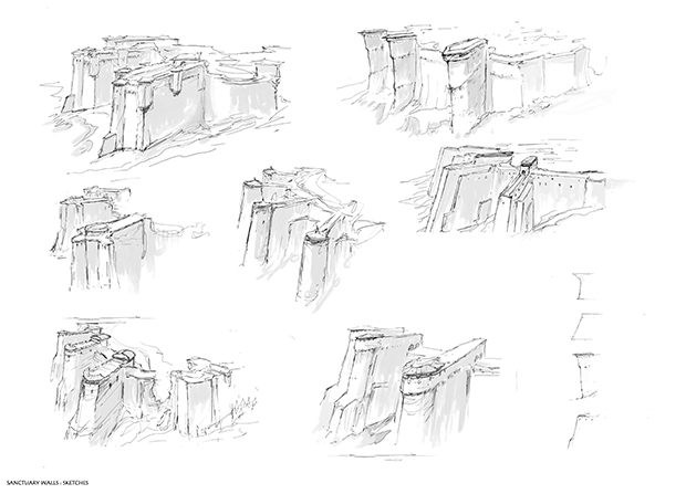
*Citadel Gate was the first official map we produced, and it had the challenge of representing the global art direction we were aiming for, which meant a lot of back and forth to find the right balance between shapes, architectural ingredients and scale. The initial brief was to give the feeling of a huge dam and of a stronghold built on a cliff, at a height that would be impregnable from a frontal assault. In the first phase of the conception we had very few constraints since we did not have to think too much about gameplay requirements yet. The goal at this stage was more to reduce the scope of possibilities. *
To do so, I started with a series of sketches of the ramparts and surrounding walls as they were representative of the map fantasy, a fortress, and they would contribute to give its own identity to this location among the others to come.

*After discussing with Christian Diaz, our art director on For Honor, to validate or disregard a few different directions, the idea started to emerge, allowing me to go more in depth in the design. *

*Once the aspect of the walls was set, it was time to jump to a global view of the stronghold. *
*I went really conventional for that part, drawing freehand in Adobe Photoshop software to bring the shapes I wanted. I did not look for photo references at this stage, because I did not want to be influenced by pre-existing designs that early in the conception process. *

*Here is a color mood based on the previous concept sketch, with an attempt to bring an imposing keep in the center. For this step, references of actual castles and fortified sites from northern Europe were extremely useful. *

*Now that’s a 3D mock-up of the scene, which had been built by level artists and level designers to set the right volumes for gameplay, navigation, and fight. This led to the next concept art phase of defining and detailing the shapes and bring the feel we wanted, while staying accurate within the given constraints. *
Below is a final iteration for the arm of the rampart, initially seen as an early sketch in image #3.

Below, a mood shot of the inner courtyard in action.

Props are also part of the design of the map, as they help to create the fantasy of a battlefield, like this catapult shown below.

The castles, at the core of several For Honor maps, are here to give an emotion, a feeling of strength, grandeur and importance rather than to match historical requirements. This allows our team to stretch reality and to focus on the function they have in our game (like ramparts rather than a courtyard, for example). Still, we stayed practical in our approach to raise credible structures that could stand against assaults and time.”


